


Sustainability round-up - interesting articles from around the web
Image by Lori Lo from Pixabay Google Launching New Mapping and Emissions Reduction Technologies (GreenCitizen) UN Youth Forum focuses on sustainable future for al . . .
A great learning experience with committed, caring people. Passionate about what they do.

Pathways To Learning . . . Since 2005

Find, research, discover the top international schools in Hong Kong and Singapore. Compare up to 4 schools simultaneously
Compare School's Now!
School &
|
Global
|
School & Uni
|
ABOUT ITS EDUCATION ASIA
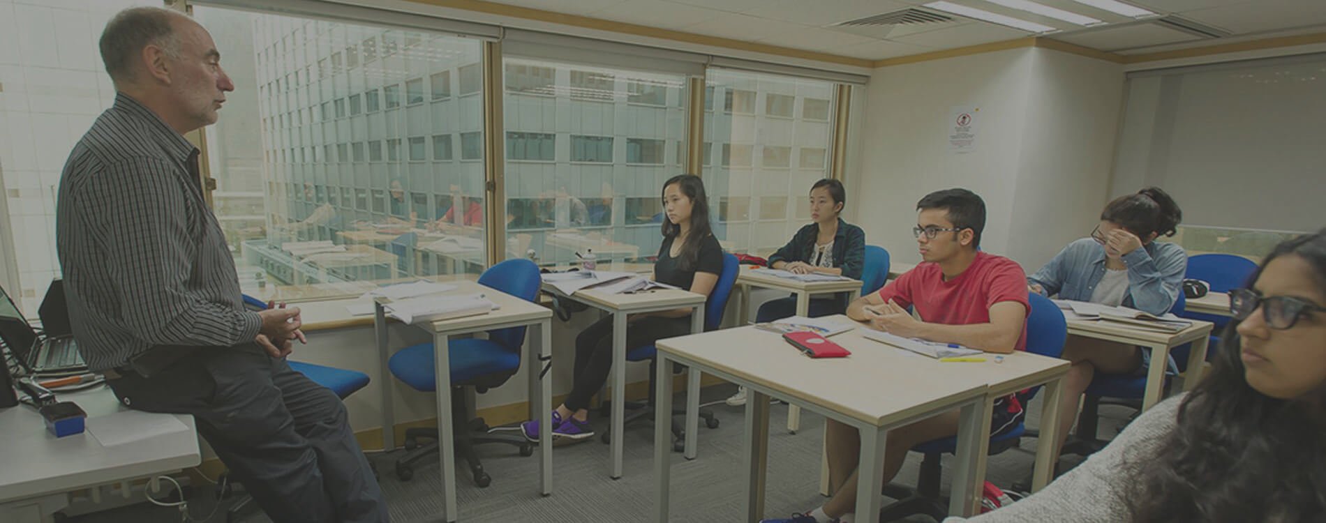
ITS Education Asia (ITS) provides flexible learning options (English medium) for a comprehensive range of university, secondary and primary school subjects and courses. Students learn with us both full-time and as tutorial support for mainstream school. We have a wide range of fully qualified and experienced international teachers, examiners & tutors who are native English speakers (or language specialists) as well. ITS operates a school in Hong Kong registered with the Hong Kong Education Bureau which is Hong Kong’s only alternative open-access examination centre for IGCSE, IAL, GCE and many more exams. We allow students from all over the world to access these schools with live lessons via a tailor made online classroom which we have been using since 2012. ITS is accredited with a wide range of official government and other educational bodies including UCAS, Pearson Edexcel, Cambridge ATS, CIOT, LSAC and more.